Better Eggs —

Gareth and Alice came to us and said – “can you help us brand our egg business?” and we said “sure can” – we were eggstatic!!! 

We learnt these hens aren’t just free range, they are free to range in a forest of 100,000 regenerating native trees! Sleeping in a state of the art temperature-controlled barns.

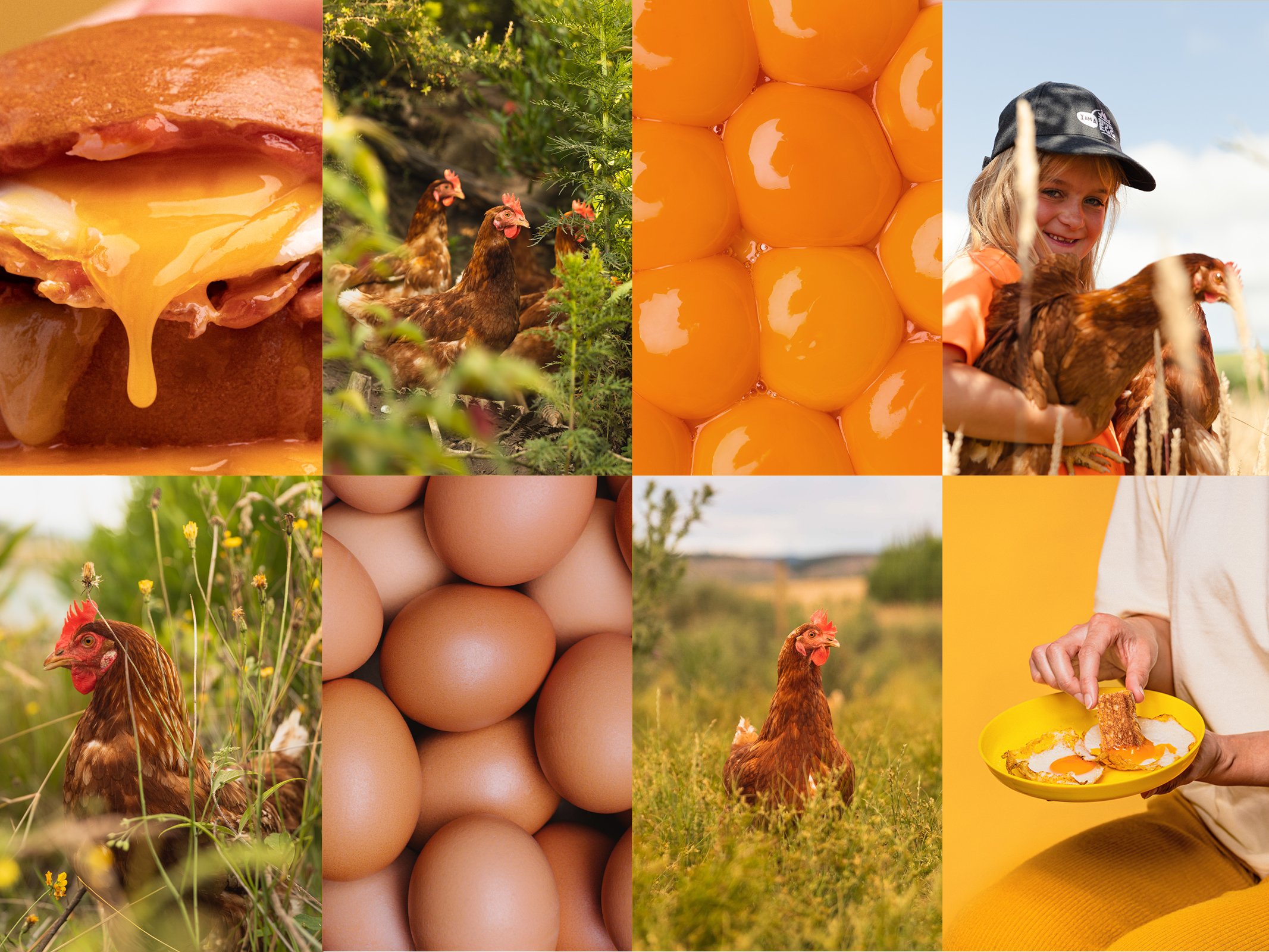
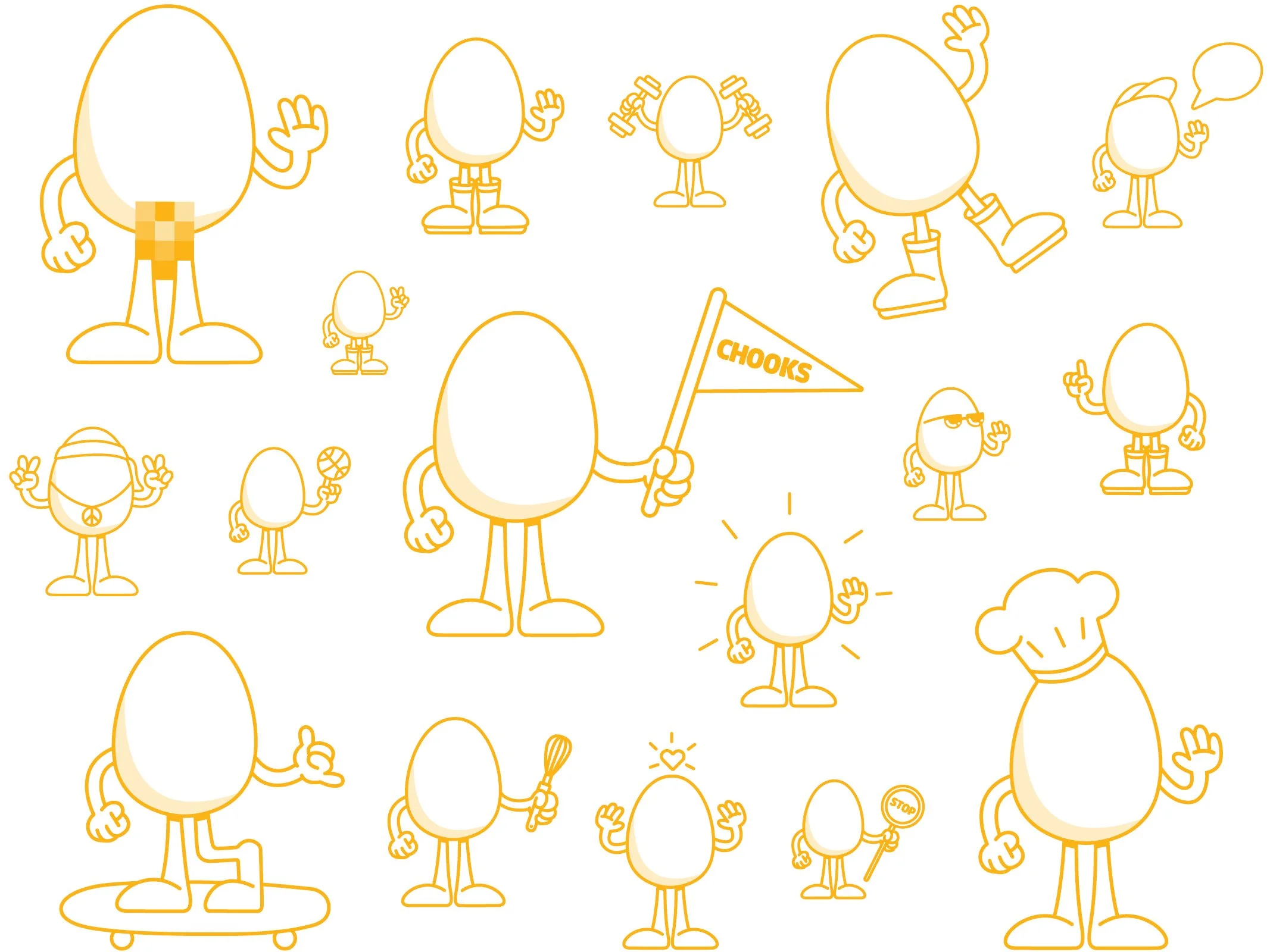
Our graphic inspiration came from the heart of the egg - a yolky pot of gold. Rich, bright, full of life and a belly full of joy! (surprisingly something not often talked about in the category). We wanted it to be loveable, like something you could easily wear on a t-shirt or a skating down the street.

Our idea was simple – Making Every Day Better – but more than an idea it is a clear perspective and method for the brand - shaking up the category by showing the care needed to keep the goodness great.

With Better Eggs we wanted to show our passion for eggs everywhere we could - better for our health, better for our environments and better for the food moments we all love to be a part of.  

To teach people exactly what better looks like our chief eggucator Forest was created to explain all the eggy benefits and the finer details of how we make ‘better’ happen.

Better farms = better hens = better eggs and of course better packaging – not the same stuff everyone else uses. Ours came from Hartmann’s in Denmark. It takes a while to get here but has the lightest footprint we could find with FSC mix certified substrate and we could get them in totally ownable colours for Eggceptional shelf blocking.

Strategy
Brand Identity
Art Direction
Packaging Design
Photography
Animation
Film

Next
Next

Waiata Anthems Campaign